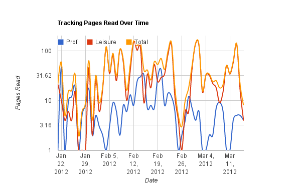
Prior to the buckle down for my thesis, I was making a nice graph of the number of pages I read a day. Part of this is because of my compulsive desire to track things, part of it is because I find creating visual representations of data a very appealing past time.
 |
| Log scale (on y-axis) of pages read |
ii
 |
| Google docs 'trends' plot of pages read |
I experimented with a number of different types of graphs while I was doing this, trying to find what's most appealing to me. I think the log plot is my favorite. It's easiest to see when I burned out on my "professional" reading at work and tried to smoke through a novel in one night (see early March). The trends plot reveals other things, in particular weekend trips or visits from company where I did essentially no reading and have drastic dips.
I'm undecided as to what I should make my next graph project, aside from the nifty research ones that aren't ready to be unveiled.

No comments:
Post a Comment